
Steve Jobs’ simplicity strategy made Apple’s technology more valuable by concentrating each product on a clear job, hiding unnecessary complexity, and explaining the benefit in language customers could immediately understand. The lesson for business owners is not to build fewer capabilities at any cost; it is to remove low-value choices and friction so customers can reach a valuable outcome faster.
That distinction matters. A product can be technically powerful yet commercially weak if buyers cannot understand, adopt, or confidently use it. Apple demonstrated that simplicity can increase perceived value, reduce support demands, strengthen marketing, and support premium pricing—but only when the difficult work continues behind the interface.
What did Steve Jobs mean by making technology simple?
Apple’s version of simplicity was disciplined prioritization, not minimalism for its own sake. The company decided which customer outcome mattered most, integrated the necessary hardware and software, and removed decisions that did not help the user reach that outcome.
Consider the original iPhone presentation. Apple did not lead with processor specifications or a long inventory of components. It framed the product as a phone, an internet communicator, and a widescreen iPod combined into one device. Apple’s official announcement described the product around those recognizable uses rather than expecting customers to interpret engineering details. The historical announcement is available in Apple’s original iPhone introduction.
This approach reduces what designers call cognitive load: the mental effort required to understand choices, remember instructions, and decide what to do next. Every unfamiliar label, redundant option, inconsistent control, and unnecessary step consumes some of the customer’s limited attention. The same decision pressure can amplify predictable judgment errors described in this guide to recognizing and overcoming cognitive biases.
Removing that load can create economic value in several ways:
- Faster evaluation: prospects understand what the product does without a lengthy sales conversation.
- Faster activation: new customers reach a useful result sooner.
- Lower service costs: fewer confusing paths can mean fewer avoidable support requests.
- Higher confidence: customers are more willing to pay when they can predict the result.
- Stronger focus: product and marketing teams spend resources on the same core promise.
This is closely related to the broader practice of directing effort toward the small number of inputs that create most of the result. The 80/20 guide to focusing on what matters most explains how the same prioritization principle can improve financial decisions.
Decision: describe the single outcome your customer is hiring your product to produce. If the answer requires several unrelated promises, your product may lack focus.
How did product focus increase Apple’s value?

Product focus begins before interface design. When Jobs returned to Apple in the late 1990s, the company reduced a confusing product portfolio and organized its core computer offering around a small matrix: consumer versus professional and desktop versus portable. The exact portfolio changed over time, but the strategic principle endured—fewer major bets receive more attention.
Concentration can improve the economics of a business. A company with ten lightly differentiated products must divide engineering, inventory, training, marketing, and support across ten sets of decisions. A company with four clearly differentiated products can concentrate those resources, provided the smaller portfolio still covers the customers it intends to serve.
Feature accumulation
Teams add options because individual customers request them, competitors have them, or removing them feels risky.
- More development paths
- More testing combinations
- Harder sales explanations
- Greater maintenance burden
Focused capability
Teams preserve the capabilities that materially improve the primary customer outcome and simplify access to them.
- Clearer product identity
- Concentrated engineering effort
- Faster customer decisions
- More consistent support
Focus does not mean every company should sell one product. It means each product should have a defined customer, job, and reason to exist. Two offerings that serve different segments may be useful. Two offerings that require a comparison chart to reveal tiny differences may create avoidable indecision. The distinction between purposeful reduction and deprivation also appears in the financial principles of minimalism.
Apple’s financial filings also show why focus should be evaluated as a business system rather than a visual preference. Revenue, margins, research spending, risks, and product concentration can be examined through Apple’s filings in the SEC EDGAR database. The lesson is not that simplicity guarantees high margins; it is that a focused portfolio can align investment behind products with meaningful demand.
Action: list every product tier, add-on, and major feature you maintain. Assign each one a customer segment, measurable outcome, revenue contribution, and ongoing cost. Investigate anything without a clear answer.
Why is intuitive design more than an attractive interface?

An intuitive product gives the user useful clues about what can be done, what will happen next, and how to recover from a mistake. Attractive typography and clean screens can support that goal, but visual polish alone does not make a workflow simple.
Apple often combines visible simplicity with substantial hidden complexity. A customer can take a photo with one obvious control while the device performs focusing, exposure adjustment, image processing, storage, and synchronization behind the scenes. Capability remains; the system carries more of the operational burden.
Apple’s current design guidance emphasizes hierarchy, consistency, accessibility, feedback, and familiar platform conventions. These principles are documented in the company’s Human Interface Guidelines. They offer a practical reminder: users should not have to relearn common interactions simply because a team wants its product to appear distinctive.
For a small business, intuitive design might mean:
- showing the recommended plan before presenting every possible configuration;
- prefilling information the customer has already supplied;
- using the same term for the same action across sales, checkout, and support;
- displaying total cost before asking for payment details;
- providing an undo option instead of forcing users through a warning-heavy process;
- placing advanced controls behind an optional expansion rather than removing them.
Decision: watch three representative customers attempt the main task without coaching. Fix the first point where they hesitate, backtrack, or ask what a label means before redesigning less important screens.
How does clear messaging make a complex product easier to buy?

Product simplicity and message simplicity reinforce each other. If a team cannot explain an offering clearly, the problem may be the copy—but it may also be unresolved product strategy.
Apple’s strongest messages typically connect a technical capability to an experience customers recognize. This does not mean specifications are irrelevant. Specifications help informed buyers compare products and verify fit. The sequence matters: lead with the outcome, demonstrate how the product produces it, and then provide evidence and detail for customers who need it.
A practical message structure is:
- Customer problem: identify the expensive, frustrating, or slow situation.
- Promised outcome: state what improves without exaggerating certainty.
- Mechanism: explain the distinctive way the product creates that improvement.
- Proof: provide a demonstration, verifiable specification, trial, case study, or transparent comparison.
- Next action: ask for one clear, proportionate commitment.
For example, “automated invoice follow-up for independent consultants” is easier to evaluate than “an AI-enabled financial communications platform.” A stronger explanation could be: “Send scheduled payment reminders from your existing invoice list, so fewer overdue accounts require manual follow-up.” The second sentence names an outcome and explains the mechanism without claiming that every invoice will be paid.
Clear communication is also a sales skill. A technically strong product still needs a buyer to understand why it deserves attention and money. Readers developing that skill can use a structured approach to turning business reading into income-producing skills rather than collecting ideas without applying them.
Action: replace the first paragraph of your product page with one sentence naming the user, outcome, and mechanism. Move secondary features lower on the page instead of forcing all of them into the headline.
Which features should you remove, hide, or preserve?

A feature should not be removed merely because few people use it. Low usage can mean low value, but it can also mean poor discoverability, seasonal need, or critical importance to a small high-value segment. Exporting data, restoring an account, or changing permissions may be used infrequently while remaining essential.
Evaluate features using customer value, usage, differentiation, risk, and full operating cost. Full cost includes design, engineering, testing, documentation, training, support, security review, and the complexity imposed on future changes.
This is a decision model, not an accounting identity. Score each category consistently—for example, from 0 to 5—and document the evidence behind the score.
Assume a subscription company is reviewing a custom dashboard builder. Interviews suggest that it creates 3 benefit points and 1 strategic point, but it requires 2 points of maintenance and creates 3 points of interface and support friction.
Net feature value = 3 + 1 − 2 − 3 = −1.
A negative score does not automatically justify deletion. The team should first determine whether the dashboard is contractually required or essential to a profitable segment. If not, it might replace the builder with three well-designed templates.
| Evidence | Likely treatment | Guardrail |
|---|---|---|
| High value and frequent use | Preserve and improve | Keep the main path fast |
| High value but infrequent use | Keep accessible, not prominent | Do not bury recovery or safety tools |
| Useful only to advanced users | Use progressive disclosure | Provide documentation and search |
| Low value and high maintenance | Deprecate or remove | Offer notice, migration, and data export |
This exercise applies the same leverage logic as investing resources in the few systems that produce outsized business results. See how business leverage concentrates effort on scalable results for a broader operating framework.
Decision: do not ship, keep, or remove a feature based on opinion alone. Require evidence about customer outcomes, strategic fit, total cost, and the consequences for affected users.
How can a business simplify without damaging capability?
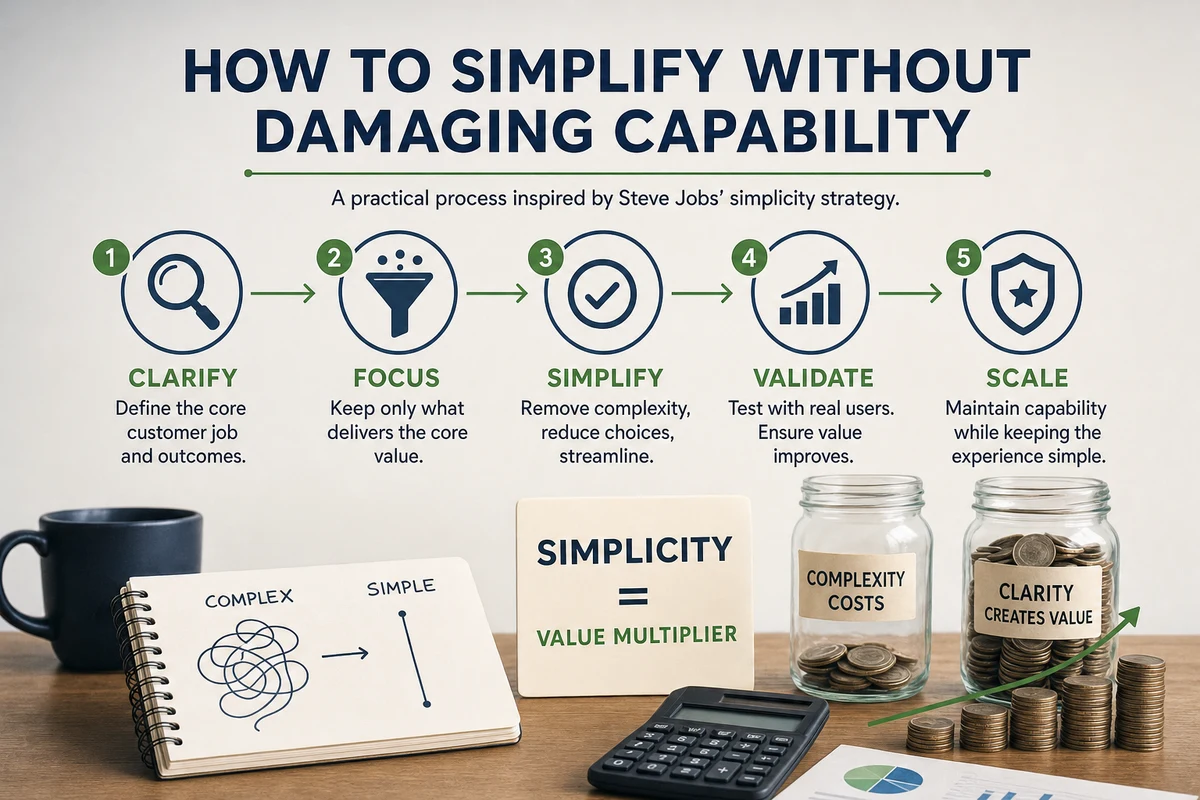
The safest process treats simplification as a measured product change, not a cleanup exercise. Start with one high-volume workflow, establish a baseline, and test whether removing friction improves both customer and business outcomes.
Map the customer’s shortest successful path
Choose one valuable outcome, such as completing a purchase, publishing a report, or booking an appointment. Record every screen, field, decision, wait, handoff, and error the customer encounters. Separate required steps from steps that exist because of internal systems or historical habits.
Classify each source of complexity
Label every element as essential, optional, redundant, or uncertain. Essential complexity may include legal consent, security verification, or information genuinely needed to deliver the service. Optional complexity can often be delayed until the user asks for it. Redundant complexity should be removed or automated. Uncertain items need research.
Run a reversible test and measure the result
Test the simplified path with a limited customer group for two to four weeks, or long enough to capture a representative buying cycle. Compare completion rate, time to value, error rate, support contacts, refunds, conversion, and retention. Do not celebrate a higher signup rate if refunds or service costs rise later.
Simplification review checklist
- Name the single customer outcome being improved
- Measure the current completion time and failure rate
- Identify advanced users and accessibility needs
- Preserve security, legal, and data-export requirements
- Prototype the reduced path before rebuilding the system
- Test with representative customers instead of employees only
- Create a rollback or migration plan
- Review downstream retention and support costs
Automation can help when it removes repetitive work without concealing important decisions. The principles in using scheduled automation to reduce repetitive work can help teams distinguish useful automation from complexity that merely moves out of sight.
Action: select one workflow this week, capture its baseline metrics, and test one reversible reduction. Avoid attempting a company-wide simplification program before proving the method.
When does simplicity fail, and what should you do next?
Simplicity fails when a business removes control that customers need, hides material information, or optimizes the first interaction at the expense of long-term use. It can also fail when a company copies Apple’s visual restraint without possessing Apple’s engineering resources, integrated ecosystem, distribution, or brand recognition.
Common failure modes include:
- Oversimplifying professional tools: expert users may value speed, customization, and dense information more than guided workflows.
- Removing features without migration: customers can lose processes, data, or integrations on which their businesses depend.
- Using one default for everyone: a sensible default should remain changeable when customer circumstances differ.
- Hiding prices or limitations: this may make an initial screen cleaner while increasing distrust and abandonment later.
- Confusing fewer choices with better choices: a narrow portfolio still fails if it omits the option the target customer needs.
- Ignoring accessibility: reducing visible controls or instructions can make a product harder to use for some customers.
The practical goal is layered capability: make the common path obvious, preserve advanced functions where justified, and reveal complexity when the user’s task requires it. A beginner should be able to start without mastering the whole system, while an experienced user should not be trapped by the beginner interface.
Steve Jobs’ simplicity strategy is therefore best understood as resource allocation. Apple chose where complexity belonged: inside engineering and operational systems rather than in every customer decision. That principle can improve value even in a small company, but only when it is supported by evidence and careful execution.
Your prioritized next step is to choose the customer workflow tied most directly to revenue or retention. Measure its current time, errors, abandonment, and support demand; then remove or defer one low-value decision while preserving necessary capability. If the test improves the customer outcome without shifting costs or risk elsewhere, repeat the process on the next highest-value workflow.